Every company has a story behind its origin. Coca-Cola was a result of an experiment to find an alternative to morphine by one John Pemberton. The man behind Boeing, William E. Boeing, broke his own plane and struck upon the idea to make his own, only better. Creativity finds its place through many means and mostly through intelligent design. Logos are one such medium that convey illuminating meanings and messages reflecting the company’s values, origins or stories behind their beginnings. Here we list ten such familiar companies’ brand logos that carry a hidden meaning nestled in their intelligent design.
Ever thought what is the hidden meaning in LOGOS, just take a look & found yourself
#1
The three ellipses seen in the logo for Toyota represent three hearts: the heart of the customer, the heart of the product, and the heart of progress in the field of technology
#2
Yes, the “M” for McDonald’s and there really isn’t another meaning. In the 60’s, McDonald’s wanted to change the logo but their design consultant and psychologist Louis Cheskin insisted that they left the golden arches. According to BBC, he said customers will unconsciously recognize the logo as “symbolism of a pair of nourishing breasts.” Whether this is true or not, their logo is one of the most recognizable in the world.
#3
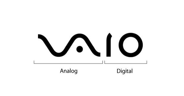
At first you just see the word VAIO, but look a little closer and you’ll see the first two letters represent an analog symbol and the last two letters are binary.
#4
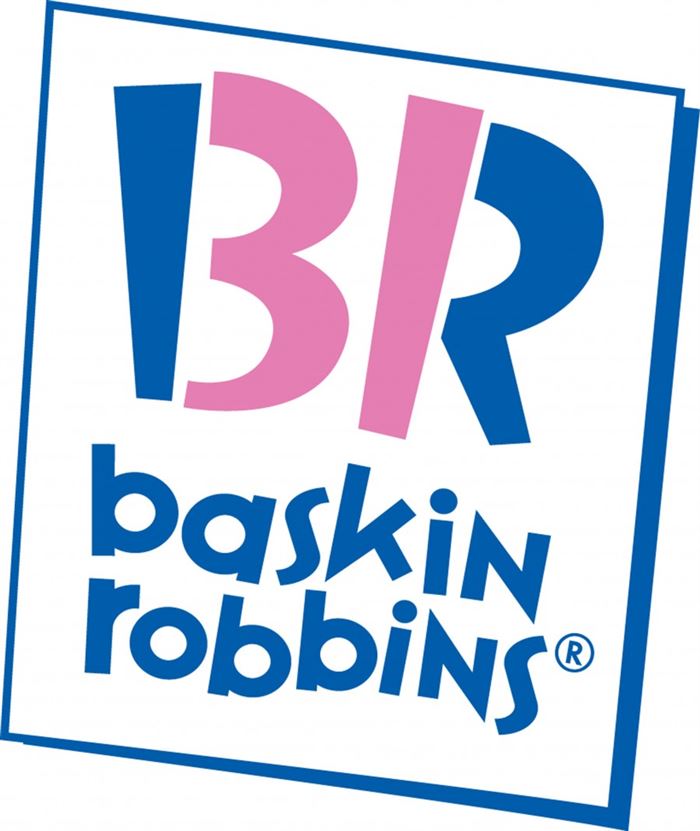
Take a look at what’s highlighted in pink. Look familiar? It’s a 31, which is the number of flavors they offer.
Owned by the company Dunkin Brands, Baskin Robbins’ logo has an interesting meaning. The ice cream giant is known for its 31 flavours that it offers. The number 31 can be seen in pink colour in the large B and R alphabets written above the name Baskin Robbins in the logo. As per Baskin Robbins’ VP of marketing, Carol Austin, ‘The 31 stands for our belief that our guests should have the opportunity to explore a fun, new ice cream flavor every day of the month’.
#5
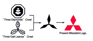
The Mitsubishi logo is rooted deeply in history. It combines the three-leaf crest of the Tosa Clan and the three-diamond crest of the Iwasaki family. The three diamonds represent reliability, integrity, and success. But it doesn’t stop there. The word “Mitsubishi,” according to Penske Social, translates to “mitsu” (three) and “hishi” (water chestnut, used in Japan to mean a rhombus or diamond shape).
#6
This logo actually has two hidden messages. First, it features an N and a W in negative spaces. Second, the triangle in the circle points northwest as if it’s a compass.
#7
Your initial thought when looking at the Amazon logo might be that the arrow looks like a smiley face, meaning Amazon is there to make its customers happy. Well, notice that the arrow is pointing from the a to the z; representing the fact that Amazon provides a variety of items for sale, literally from A to Z.
The US-based e-commerce and cloud computing firm wanted to depict ‘the ultimate expression of customer satisfaction: a smile. Hence, the curve below ‘Amazon’ in the logo stands for that. But it doesn’t end here. The smile begins under ‘a’ and ends under ‘z’. As per Amazon’s press release, this emphasizes that Amazon.com offers anything – from A to Z – that customers may be looking to buy online.
#8
Ever notice how the Google logo has four primary colors in a row then it’s broken by a secondary color? This was entirely intentional. Google wanted to show that they don’t play by the rules and are also playful without making the symbol bulky. To do that, they just used simple letters and colors.
The search giant went through a lot of iterations before arriving at what it is right now – a colour assortment of its names’ alphabets. However, there is one crucial detail that not many are aware. All the letters in Google’s logo are in primary colours except the letter L. Why so? Ruth Kedar, the designer of Google’s logo, said in an interview that the letter L, in Google is in a secondary colour unlike all other letters in the logo. This represents that idea that Google doesn’t follow the rules.
#9
Look closely at the “o.” Do you notice anything? No? Don’t worry because most people wouldn’t notice it. It’s actually the Denmark flag. This wasn’t always the original intention. Coca Cola discovered that part of its logo looks like the Danish flag, which has been named the happiest country on earth. Once they discovered that, they set up a media stunt in Denmark’s biggest airport, where they welcome people with flags. Still can’t see the flag? Here you go:
#10
Company founder Marc Ewing was given the Cornell lacrosse team cap(with red and white stripes) while at college by his grandfather. He lost it andHad to search for it desperately. The manual of the beta version of Red HatLinux had an appeal to readers to return his Red Hat if found by anyone!
#11
Ever wondered what the three stripes on the Adidas Logo mean? They represent a mountain, pointing out towards the challenges than are seen ahead and goals that can be achieved.
Adidas’ logo has had many iterations since the company came into being. Its logo has been changed twice in the past but the three stripes have been carried always. The one it currently has, three stripes above the brand name, carries a special meaning. The new logo is designed to look like a mountain. Denoting a challenge in itself – as climbing a mountain is – to push people to explore their limits.
#12
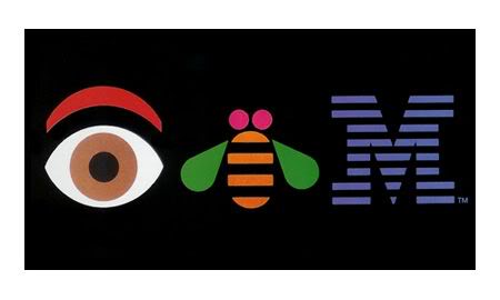
Paul Rand (who designed the iconic IBM logo in 1972) designed this ‘eye bee M’ logo in 1981. I like that they are quite relaxed about the logo, unlike certain other companies who do not like the logo to be tampered with in any way even for internal promotions
#13
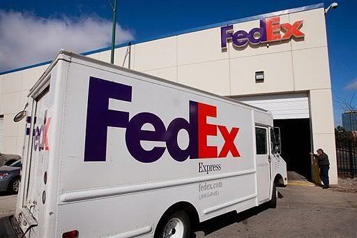
Noticed a hidden symbol in the Federal Express logo?? The ‘arrow’ that you can see between the E and the x in this logo. The arrow was introduced to underscore speed and precision, which are part of the positioning of the company.
#14
The SUN Microsystems logo is a wonderful example of symmetry and order. It was a brilliant observation that the letters u and n while arranged adjacent to each other look a lot like the letter S in a perpendicular direction.
#15
The word was invented by Jonathan Swift and used in his book Gulliver’s Travels. It represents a person who is repulsive in appearance and action and is barely human. Yahoo! Founders Jerry Yang and David Filo selected the name because they considered themselves yahoos.
#16
The Greek root “xer” means dry. The inventor, Chestor Carlson, named his
Product Xerox as it was dry copying, markedly different from the then prevailing
Wet copying.
Product Xerox as it was dry copying, markedly different from the then prevailing
Wet copying.
#17
Founder Paul Galvin came up with this name when his company started manufacturing radios for cars. The popular radio company at the time was Called Victrola.
#18
It was coined by Bill Gates to represent the company that was devoted to MICROcomputer SOFTware. Originally christened Micro-Soft, the ‘-‘ was removed later on.
#19
Bob Noyce and Gordon Moore wanted to name their new company ‘Moore Noyce’ but that was already trademarked by a hotel chain, so they had to settle for an acronym of INTegrated ELectronics.
#20
Founder Jack Smith got the idea of accessing email via the web from a computer anywhere in the world. When Sabeer Bhatia came up with the business plan for the mail service, he tried all kinds of names ending in ‘mail’ and finally settled for Hotmail as it included the letters “HTML” – the programming language used to write web pages. It was initially referred to as HoTMaiL with selective upper casings.
#21
The name is not an acronym but an abbreviation of San Francisco. The company’s logo reflects its San Francisco name heritage. It represents a stylized Golden Gate Bridge.
As per John Morgridge, Former CEO of Cisco Systems, finding a logo for the company literally involved taking drive in the sunshine for the companies’ founders. While driving to Sacramento to complete registration formalities for the company, the founders saw the Golden Gate Bridge framed in the sunlight. The pipes above the ‘Cisco’ name denote the Golden Gate Bridge and that’s how they decided on the logo. Further, Morgridge says, bosses hoped the logo would shape the future, “convey something about creating an authentic life and making a living at something you believe in, in a place you love, with people you really like to be with”.
#22
The apple in this logo is taken from the Bible story of Adam and Eve, where the apple represents the fruit of Tree of Knowledge, with a pun on “byte/bite”.
#23
The star in the three corners on their logo represents the Mercedes-Benz dominance on land, sea and air
The iconic tristar on Mercedes Benz cars has its origins in the imagination of Gottlieb Daimler, the founder of Daimler-Motoren-Gesellschaft (DMG). As per a story, Daimler drew a tristar on the top of a letter he wrote to his sons. The three stars represent three types of mobility on land, air and sea. DMG trademarked the three and four-pointed stars and later when Daimler merged with Benz & Cie in 1926, the tristar logo went on become one of the most recognised logos around the world.
#24
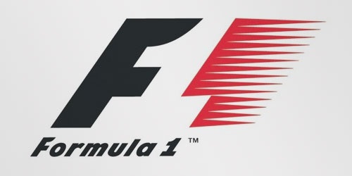
At first, this logo might not make much sense. But if you look closely, youll see the number 1 in the negative space between the F and the red stripes. I also love how this logo communicates a feeling of speed.
#25
Everything in Dell’s logo is fine except a slanted E. The reason behind this, as per Siegel+Gale – the agency who designed this logo – is, that it ‘embodies the company’s brash humour and aggressiveness’. And the tilted ‘E’ enlivens the logo and it captures the irrepressible spirit of the company that ‘stood the PC industry on its ear.’
#26
German luxury automobile manufacturer Audi has a rather melancholy tale that explains the meaning of its logo. Audi was founded by August Horch in 1909, who also founded the company Horch in 1899. The four-rings in its logo represent Germany’s four oldest carmakers, namely, Audi, Horch, DKW and Wanderer, that had to band together to make Audi as we know it.
#27
In an interview, Tom Monaghan, the founder of Domino’s Pizza explained how easily he struck upon the name of the brand. During the 60s, while he was searching for a name for his pizza venture- that’s also when he had acquired just three outlets– an employee returned after delivering a pizza and said – I’ve got our name! Domino’s! As Monaghan had only three outlets at that time he decided that he could use a Domino as the logo with three dots on it. He planned to increase the number of dots on the logo whenever they added a new store – also explaining how he’d never thought that it will go on to become a global fast food chain.







No comments:
Post a Comment